• Have something to say? Register Now! and be posting in minutes!

What do you think of the new helmets

Old Lion

Pay no attention to that man behind the curtain
21,260
6,682
533
Joined
Apr 18, 2013
Location
Emerald City, OZ
Hoopla Cash
$ 2,000.00
Fav. Team #1
Fav. Team #2
Fav. Team #3
AA1cQBWc.jpg


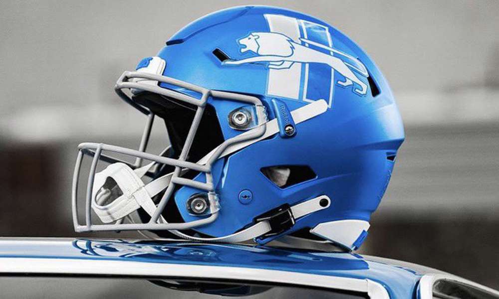
You can actually vote on the Lionswire. I hate them. I may not be a fan much longer if they go to these.

Poll: What do you think of the Lions new alternate helmets?
 

Red_Chaos

Well-Known Member
6,517
1,629
173
Joined
Apr 18, 2013
Location
Illinois
Hoopla Cash
$ 6,600.00
Fav. Team #1
Fav. Team #2
Fav. Team #3
Big no from outsider it looks like a youngster learning photoshop did it
 

Mebert

Not Mebert's Alt
18,095
10,068
1,033
Joined
Apr 20, 2013
Location
Salt Lake City
Hoopla Cash
$ 22,700.00
Fav. Team #1
Fav. Team #2
Fav. Team #3
I am indifferent. Uniform is not why I am a fan.
 

broncosmitty

Banned in Europe
90,068
24,032
1,033
Joined
Apr 19, 2013
Location
Almost Paradise
Hoopla Cash
$ 16,206.54
Fav. Team #1
Fav. Team #2
Fav. Team #3
I love em.

Wearing the matching Tshirt right now. Should go put on the hat too. That’s the logo of champions right there.

Still hate how the first round was handled though.
 

Edonidd

Well-Known Member
5,177
2,301
173
Joined
Aug 21, 2014
Hoopla Cash
$ 1,360.00
Fav. Team #1
Fav. Team #2
Fav. Team #3
I think the Lion itself looks dumb, but I don't mind it. I think I actually like the color with the all grey unis. But the stupid bars... I do not like the stupid bars behind the Lion. I've always liked the simplicity of our uniforms and our logo. If they were making things busier, at least do something kinda cool like that fan made logo with the mane being a stylized script of the word Lions. But instead just adding two dumb rectangles for no reason. For me that detracts from whatever they had instead of adding to it.
 

Debbie Does

Question Authority
55,247
34,224
1,033
Joined
Jul 14, 2014
Location
Delaware. By the ocean.
Hoopla Cash
$ 1,000.00
Fav. Team #1
Fav. Team #2
Fav. Team #3
I liked the old Pat Patriot logo, and the old Redskins logo, too. I suppose the Oilers logo had to go when they left Houston. Every time they change a logo because some clueless artsy fartsy type says to, the sport loses.

Think of it. When has a logo change been for the better?
 

jayfan

{firestan}
2,144
474
83
Joined
Apr 17, 2013
Hoopla Cash
$ 1,000.00
Fav. Team #1
Fav. Team #2
Fav. Team #3
1. It's just an alternate, right? Why are people acting like it's replacing something?

2. The logo is a throwback. It was the logo used in the 50's/60's. This isn't some new design someone came up with.


Under the circumstances, I don't see a problem. They're kinda sharp.
 

eaglesnut

Well-Known Member
28,872
5,747
533
Joined
Sep 2, 2014
Location
Heaven
Hoopla Cash
$ 1,000.00
Fav. Team #1
Fav. Team #2
Fav. Team #3

eaglesnut

Well-Known Member
28,872
5,747
533
Joined
Sep 2, 2014
Location
Heaven
Hoopla Cash
$ 1,000.00
Fav. Team #1
Fav. Team #2
Fav. Team #3
2. The logo is a throwback. It was the logo used in the 50's/60's. This isn't some new design someone came up with.
Well that explains the Lions history better than anything else.
 

Old Lion

Pay no attention to that man behind the curtain
21,260
6,682
533
Joined
Apr 18, 2013
Location
Emerald City, OZ
Hoopla Cash
$ 2,000.00
Fav. Team #1
Fav. Team #2
Fav. Team #3
Well that explains the Lions history better than anything else.
The logo should be thrown back then. Although that is the last time we won a championship so...
 

eaglesnut

Well-Known Member
28,872
5,747
533
Joined
Sep 2, 2014
Location
Heaven
Hoopla Cash
$ 1,000.00
Fav. Team #1
Fav. Team #2
Fav. Team #3
The logo should be thrown back then. Although that is the last time we won a championship so...
It should be a Lion looking right at you with a joy for killing in its eyes.
 
Top