
- Thread starter
- #1
Mariners_44
Well-Known Member
- 2,020
- 651
- 113
- Joined
- Apr 18, 2013
- Location
- Gilbert, AZ
- Hoopla Cash
- $ 1,000.00
- Fav. Team #1

- Fav. Team #2

- Fav. Team #3

So what do you think of the new logo?


I like it, it's not a logo they will have on their Uni it's just for branding. I also changed my Avatar to the new logo so i may be bias lol
I like the 2016 logo better
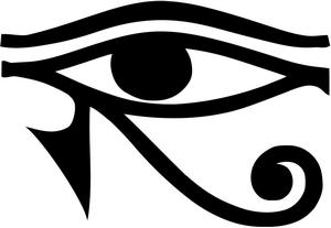
Had sort of the mystical "Eye of Horus" thing going for it.
It's LITERALLY the same logo, with two dimensions, as seen from the front. With deeper colors.
Heh, yeah, but the proportionality seems off. Too wide. Drag from the corners, not the sides!It's LITERALLY the same logo, with two dimensions, as seen from the front. With deeper colors.

It's LITERALLY the same logo, with two dimensions, as seen from the front. With deeper colors.


