• Have something to say? Register Now! and be posting in minutes!

The Hockey News Is Ranking The NHL Logos From 30 to 1

KennyBanyeah

Buckle up!!
16,164
6,092
533
Joined
Apr 23, 2010
Location
West
Hoopla Cash
$ 1,042.93
Fav. Team #1
Fav. Team #2
Fav. Team #3
35,085
2,053
173
Joined
Apr 19, 2010
Location
Tucson, AZ
Hoopla Cash
$ 1,000.00
Fav. Team #1
Fav. Team #2
Fav. Team #3
1972-New-England-Whalers-Logo.jpg
 

pixburgher66

I like your beard.
26,285
521
113
Joined
Jan 17, 2010
Location
Pittsburgh
Hoopla Cash
$ 1,000.00
Fav. Team #1
Fav. Team #2
Fav. Team #3
Blues, Yotes, Hawks left?


*sings* One of these things is not like the other, one these things does not belong
 

IPostedWhat

I'm So High Right Now
45,362
25
0
Joined
Apr 27, 2010
Location
The Blue Lotus Opium Den
Hoopla Cash
$ 1,000.00
Fav. Team #1
Fav. Team #2
Fav. Team #3
No. 3: St. Louis Blues

bluesmain-640x427.jpg


We’re nearing the end of our NHL logo rankings and today we crack the top three with the St. Louis Blues.

The Blue Note has represented St. Louis’ NHL team since its inception in 1967, with some alterations along the way. It’s a symbol that stands not just for the team, but the city and region, which is renowned for its history of jazz and blues music. The color blue is an obvious fit with the name and is accentuated with a yellow that used to take up more space on the logo and jersey.

What we liked about the design were the colors and stylized look that jumps at you. It’s clean, to the point and representative of the city. It’s a slick look that’s easily identifiable. What else can you ask for from a team named the Blues?

HISTORY OF THE BLUES LOGO
In 1967, the St. Louis Blues were one of six expansion franchises that were added on to the NHL’s Original Six. What would the new team be called? For owner Sid Saloman Jr., it was an easy decision. From the St. Louis Blues website:

“The name of the team has to be the Blues,” exclaimed Salomon after being awarded the new franchise. “It’s part of the city where W.C. Handy composed his famed song while thinking of his girl one morning.”

At first, the newly structured NHL was split into Eastern and Western conferences, with the Original Six in the East and the expansion teams in the West. The competition was very lopsided and though the Blues made it to the Stanley Cup final in each of their first three seasons, they were swept every time, twice by the Habs and once by the Bruins.

The original St. Louis Blues logo had the recognizable blue note inside a yellow cycle that said “St. Louis Blues” and “National Hockey League.”

In 1978-79, the circle and wording around the blue note went through a major change, while the note itself was given a little more bulk. Though this logo and the one before it were recognized as the primary looks for the team, it was just the note that appeared on the jersey.

In 1984-85, the word “St. Louis” was subtly added to the top rung of the blue note, while “Blues” was spelled out in large letters above it. This logo did appear on the team’s jerseys, though not for very long.

This logo also introduced a tinge of red into the logo, which would remain for 15 years.

In 1987-88, the script “Blues” was removed from the top of the logo and the blue note that was introduced in 1984 was enlarged to become the stand-alone design. For the first time, it sat by itself as the primary logo for the team and would inspire a pretty terrible jersey.

If you’ll recall, Wayne Gretzky wore this jersey when he briefly played there in 1996 and this secondary logo appeared on the shoulder. Yikes! The ’90s, everybody.

Finally, in 1998, the Blues went to the logo they still use today. The red outline was removed and the blue coloring was darkened. Out of all the Blues’ logos, this one is my favorite.

And though we don’t take alternate logos into consideration for these rankings, the Blues currently have one of the best in that department, with the blue note sitting inside a circle and the Gateway Arch in the background.
 
35,085
2,053
173
Joined
Apr 19, 2010
Location
Tucson, AZ
Hoopla Cash
$ 1,000.00
Fav. Team #1
Fav. Team #2
Fav. Team #3
I predict IPW is about to post the Blackhawks' logo coming in at #3.

Darn. I was wrong.
 
35,085
2,053
173
Joined
Apr 19, 2010
Location
Tucson, AZ
Hoopla Cash
$ 1,000.00
Fav. Team #1
Fav. Team #2
Fav. Team #3
That is an attractive logo. No dissenting opinions in the article, either, it seems. I've always been a fan of the color combination, too, and it lends itself to a clean, simply stylish uniform. I'm fine with it being this high, though I'd put some other logos ahead of it (like the Wings' logo, which is really quite beautiful).

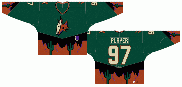
But this means the Coyotes have a top two logo, and that's nonsense.
 

mattola

Scotchy Scotch Scotch!
42,490
14,134
1,033
Joined
May 9, 2010
Location
Planet Earth
Hoopla Cash
$ 1,000.00
Fav. Team #1
Fav. Team #2
Fav. Team #3
That is an attractive logo. No dissenting opinions in the article, either, it seems. I've always been a fan of the color combination, too, and it lends itself to a clean, simply stylish uniform. I'm fine with it being this high, though I'd put some other logos ahead of it (like the Wings' logo, which is really quite beautiful).

But this means the Coyotes have a top two logo, and that's nonsense.

phoenix-coyotes-logo.gif
 

forty_three

Stance: Goofy
47,995
22,548
1,033
Joined
Apr 19, 2010
Hoopla Cash
$ 1,000.00
Fav. Team #1
Fav. Team #2
Fav. Team #3
Where, precisely, is the Hockey News office?

And, completely unrelated, anyone know which key to turn to activate a SCUD missile?
 
Top