• Have something to say? Register Now! and be posting in minutes!

The Hockey News Is Ranking The NHL Logos From 30 to 1

awaz

Well-Known Member
21,817
1,958
173
Joined
May 15, 2010
Location
NC
Hoopla Cash
$ 191.67
Fav. Team #1
Fav. Team #2
Fav. Team #3
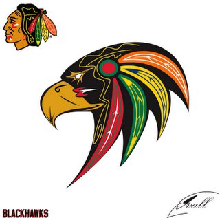
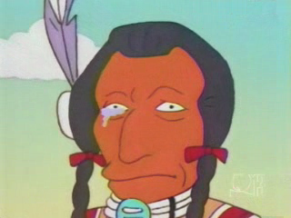
I think a huge portion of the favor shown to this logo is the fact that it's better than the last one. But honestly, that is not hard at all. Anyone with an 8 box of crayons could have done better than that first one.

I'd actually argue less crayons would be give you an advantage in that situation.
 

IPostedWhat

I'm So High Right Now
45,362
25
0
Joined
Apr 27, 2010
Location
The Blue Lotus Opium Den
Hoopla Cash
$ 1,000.00
Fav. Team #1
Fav. Team #2
Fav. Team #3
HERE IT IS....WE'VE FINALLY REACHED #1

drumroll.gif


No. 1: Chicago Blackhawks

blackhawksmain-640x427.jpg


When THN’s seven-person panel sat down to come up with our rankings of the 30 NHL logos, we were basically in full agreement which team would be No. 1.

We didn’t want history to influence our decisions. The Toronto Maple Leafs and Montreal Canadiens sit outside the top 10 for that reason. Ranking all the Original Six 1-6 is boring, predictable and doesn’t accomplish what we wanted to do here: reward the best logos, not the longest history.

Even still, the Chicago Blackhawks stood up to that measurement. The vibrant color combination and the respectful way it honors a WWI battalion and a Native American chief sets this logo apart from the rest. If we handed out the Three Stars of these logo rankings, the Blackhawks logo would be one, two and three.

HISTORY OF THE BLACKHAWKS LOGO
In 1926, coffee tycoon Frederic McLaughlin was awarded an NHL franchise for a $12,000 entry fee. To build a roster, McLaughlin purchased players from the Portland Rosebuds, a franchise from the disbanding Western League. But rather than take the name of the WHL team they had purchased – as the Red Wings initially did with the name Cougars – McLaughlin wanted his own nickname. Rosebuds simply wasn’t good enough for a hockey team.

In World War I, McLaughlin was a commander in the 333rd machine gun battalion of the 86th division in the U.S. Army, whose members called themselves “Black Hawks.” The name honored the Sauk Indian chief who sided with the British in the War of 1812. In the 1830s, Chief Black Hawk fought again against the Americans when he brought his tribe back across the Mississippi River and into Illinois to plant crops and reclaim their land. In 1832, he lost the brief war to the Americans, was captured and taken on “tour” of the East Coast. He would briefly be put in jail before he was released.

The original Chicago Black Hawks logo was a crudely drawn black and white Native American, inside a circle that spelled out the team’s name.

For a number of reasons, the Chicago Blackhawks logo doesn’t get, nor deserve, the same kind of contempt as Washington’s NFL Football club does, but if the team still used the logo they did for two years in the mid-1930s, perhaps the conversation would be different.

Color appeared in this logo for the first time in 1935. The black and white circle and background remained, but Black Hawk’s hair was turned light and his skin red. Thankfully, this logo was replaced with something much more respectful in 1937.

In 1937-38, the Black Hawks moved to an updated design that starts to resemble our No. 1 logo. More colors were added – green and blue – and the look was cleaned up quite a bit.

In the first year the team used this design, they won their second Stanley Cup with a team led by such players as Paul Thompson, Johnny Gottselig, “Mush” March, Carl Voss and Earl Seibert.

The Black Hawks may have won a Cup in the first year they used their third logo, but by the time they retouched their design again in 1955, they had become a franchise defined by its ineptitude. In the 17 years between their championship in 1938 and the redesign in 1955, Chicago missed the playoffs 11 times.

The circle and lettering around Black Hawk remained, but the face was altered. The drawing of the head was bigger, the feathers in his hair became multi-coloured and red and white war paint was added to his face. We’re now one step away from the final evolution of the Black Hawks logo.

The team would win its third Stanley Cup with this logo in 1961, but wouldn’t win another until Patrick Kane came along.

In 1964-65, three years before the NHL expanded from six to 12 teams, the Black Hawks introduced a logo they still use to this day. The circle and lettering was dropped from the logo, leaving plenty of room for a bigger Black Hawk head to dominate the team’s jersey. In the 1980s, the team put the two words in its nickname together, changing it from Black Hawks, to Blackhawks.

This logo saw plenty of miserable down years with the team, but it’s also witnessed the franchise’s awakening in the 21st century and the build up of a Stanley Cup contending powerhouse that has now won two of the past five championships.

What differentiates this logo from the Washington Football Club – and why there is no great controversy around it – is that it honors a great chief and does so with a sophisticated, artful design. It’s not a cartoon like Chief Wahoo of the Cleveland Indians and the team’s nickname that it represents isn’t the outright slur Washington’s is. This name and logo honors the memory of a great Native American chief who stood up to the injustices inflicted upon his people.

Dissenting opinion: “From my experience, most people look at the Chicago Blackhawks logo and see one of the best logos in sports. I envy them. For me, this is like one of those vintage “Magic Eye” posters. I can never see it. The best logo in the NHL? It’s a team named after a military unit named after a Native American named after a bird. The logo is a man’s head. I just don’t see it.” - J.P. Hoornstra, sportswriter for the Los Angeles News Group.
 

IPostedWhat

I'm So High Right Now
45,362
25
0
Joined
Apr 27, 2010
Location
The Blue Lotus Opium Den
Hoopla Cash
$ 1,000.00
Fav. Team #1
Fav. Team #2
Fav. Team #3
Personally, I never got why people are so adamant about it being the best logo in the NHL? :noidea:
 

elocomotive

A useful idiot.
37,462
4,807
293
Joined
Apr 19, 2010
Location
Planet Mercury
Hoopla Cash
$ 201.67
Fav. Team #1
Fav. Team #2
Fav. Team #3
But I'm sure all the nostalgia and history will put the Hawks, Habs, and Bruins, and other original 6 at the top.

-Blackhawks - The color scheme and the tomahawk shoulder patches are fantastic, but it's a giant indian head. If anything, the actual logo is a little bit creepy and weird.

I'll quote what I said a month ago.
 

Comeds

Unreliable Narrator.
22,762
11,251
1,033
Joined
Apr 21, 2010
Location
Baltimore
Hoopla Cash
$ 754.60
Fav. Team #1
Fav. Team #2
Fav. Team #3
Well it is pretty cool the way it spells "Chicago' in the feather pattern. I didnt notice that for years.
 

forty_three

It’s Raining Falafel
45,348
19,792
1,033
Joined
Apr 19, 2010
Hoopla Cash
$ 1,000.00
Fav. Team #1
Fav. Team #2
Fav. Team #3
zh2dlesaa9i69f6flilx.gif


^Racist!!!

blackhawksmain-640x427.jpg


^Best logo!!!

:wtf:

It's a small matter of degrees, but "Black Hawk" was a person and a military unit named in his honor.

"Red Skin" is a racial slur.

The context of the images is different. Not much, but different.

It's the difference between naming your team the Kings (after MLK) and calling them the uppity darkies. You can use the same picture and get different connotations.

IMO, the Blackhawks are classic because the whole uniform. It's a great combo and essentially unchanged since before I was born. Same reason I would vote Habs, Wings, Leafs and Bruins high.

Not the Rangers though.


Fuck the Rangers. :nod:
 

DragonfromTO

Well-Known Member
12,006
2,447
173
Joined
Jul 3, 2013
Hoopla Cash
$ 1,000.00
Fav. Team #1
Fav. Team #2
Fav. Team #3
It's a small matter of degrees, but "Black Hawk" was a person and a military unit named in his honor.

"Red Skin" is a racial slur.

The context of the images is different. Not much, but different.

It's the difference between naming your team the Kings (after MLK) and calling them the uppity darkies. You can use the same picture and get different connotations.

IMO, the Blackhawks are classic because the whole uniform. It's a great combo and essentially unchanged since before I was born. Same reason I would vote Habs, Wings, Leafs and Bruins high.

Not the Rangers though.


Fuck the Rangers. :nod:

The "Fighting Sioux" isn't a racial slur and UND ran into tons of problems with that logo/name.
 

Nasty_Magician

Team Player
18,987
4,467
293
Joined
Jul 6, 2010
Location
North Jersey
Hoopla Cash
$ 1,000.00
Fav. Team #1
Fav. Team #2
Fav. Team #3
It's a small matter of degrees, but "Black Hawk" was a person and a military unit named in his honor.

"Red Skin" is a racial slur.

The context of the images is different. Not much, but different.

It's the difference between naming your team the Kings (after MLK) and calling them the uppity darkies. You can use the same picture and get different connotations.

IMO, the Blackhawks are classic because the whole uniform. It's a great combo and essentially unchanged since before I was born. Same reason I would vote Habs, Wings, Leafs and Bruins high.

Not the Rangers though.


Fuck the Rangers. :nod:

I hear that :suds:
 

Dacks

Militant Pacifist
2,489
222
63
Joined
Apr 21, 2010
Location
Ottawa
Hoopla Cash
$ 1,000.00
Fav. Team #1
Fav. Team #2
Fav. Team #3
The "Fighting Sioux" isn't a racial slur and UND ran into tons of problems with that logo/name.

I don't know the particular context, but the persistent association of native American culture and violence is often criticized. I think one reason the Blackhawks escape criticism is because there isn't an overt suggestion of violence in the name of logo.
 

forty_three

It’s Raining Falafel
45,348
19,792
1,033
Joined
Apr 19, 2010
Hoopla Cash
$ 1,000.00
Fav. Team #1
Fav. Team #2
Fav. Team #3
Are you going to spit in Rudy's face like that? :wink:

He'd be fine. He gets off on getting his head bashed in.

Seriously though, I think it's the "fighting" part of the UND name. It they were just the Sioux, not as many would complain.

Some would. I can find something to be offended about by every team name.
 

DragonfromTO

Well-Known Member
12,006
2,447
173
Joined
Jul 3, 2013
Hoopla Cash
$ 1,000.00
Fav. Team #1
Fav. Team #2
Fav. Team #3
He'd be fine. He gets off on getting his head bashed in.

Seriously though, I think it's the "fighting" part of the UND name. It they were just the Sioux, not as many would complain.

Some would. I can find something to be offended about by every team name.

I disagree. People seemed more upset about the indian head logo than the name.
 
Top