- Thread starter
- #1
Jack_John_Mark
¿Cómo está usted?
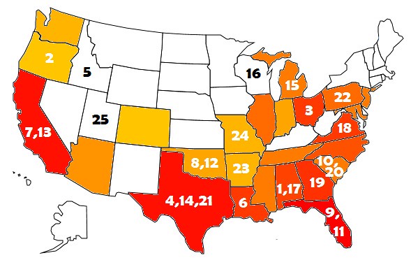
Here is a map created based on the top 1500 sought after recruits over the past 6 years. The more red the color, the more top recruits the state had. States in white had minimal amounts........for instance, Nebraska had 2.
Also on the map you will see a bunch of numbers. These numbers represent the average (final) ranking over the past 6 seasons of teams residing in these states. Not the recruiting ranking, but rather what the team finished ranked after playing the season.
To me there is some obvious correlation..........maybe I'm just drunk?


