
- Sports Forums Home
- College Football Forums
- College Basketball Forum
- NFL Forums
- NBA Forums
- NHL Forums
- MLB Forums
- Donate!
Navigation
Install the app
More options
-
Have something to say? Register Now! and be posting in minutes!
You are using an out of date browser. It may not display this or other websites correctly.
You should upgrade immediately.
You should upgrade immediately.
10 Worst Jerseys In NHL History According To TRL Hockey
- Thread starter IPostedWhat
- Start date


Otis B. Driftwood
New Member
- 3,293
- 0
- 0
- Joined
- Jun 26, 2014
- Hoopla Cash
- $ 1,000.00
- Fav. Team #1

- Fav. Team #2
- Fav. Team #3
Nice, never heard that name but I was surprised it wasn't on the list.
Everyone hated those damn things... Players and fans alike. Like T'N'T said - the generic black ones with the name and number were far better than those damn Mooterus sweaters.
elocomotive
A useful idiot.
- 37,462
- 4,807
- 293
- Joined
- Apr 19, 2010
- Location
- Planet Mercury
- Hoopla Cash
- $ 201.67
- Fav. Team #1

- Fav. Team #2
- Fav. Team #3
I'm amazed the Capitals somehow stayed off this list.
DragonfromTO
Well-Known Member
- 12,006
- 2,449
- 173
- Joined
- Jul 3, 2013
- Hoopla Cash
- $ 1,000.00
- Fav. Team #1

- Fav. Team #2

- Fav. Team #3

I'm amazed the Capitals somehow stayed off this list.
Which Caps jersey did you hate? I don't think any of them are that bad, the black ones were probably the worst but they're still not awful enough for this list.
Otis B. Driftwood
New Member
- 3,293
- 0
- 0
- Joined
- Jun 26, 2014
- Hoopla Cash
- $ 1,000.00
- Fav. Team #1
- Fav. Team #2
- Fav. Team #3
I'm surprised this one didn't make the list.
http://SportsHoopla.com/bvjnkg2
Me too.
Freakin' hideous!
Bloody Brian Burke
#1 CFL Fan!
- 37,167
- 12,172
- 1,033
- Joined
- Jun 28, 2014
- Location
- West Toronto, BC
- Hoopla Cash
- $ 1,152.09
- Fav. Team #1
- Fav. Team #2
- Fav. Team #3

I'm surprised this one didn't make the list.
http://SportsHoopla.com/bvjnkg2
Those are glorious.
pixburgher66
I like your beard.
- 26,285
- 521
- 113
- Joined
- Jan 17, 2010
- Location
- Pittsburgh
- Hoopla Cash
- $ 1,000.00
- Fav. Team #1

- Fav. Team #2

- Fav. Team #3

I think I may make my rankings of the Pens jerseys now...just for kicks and gigs.
pixburgher66
I like your beard.
- 26,285
- 521
- 113
- Joined
- Jan 17, 2010
- Location
- Pittsburgh
- Hoopla Cash
- $ 1,000.00
- Fav. Team #1
- Fav. Team #2
- Fav. Team #3
Worst to best (even though no one likely cares that much…just let me have fun):
The Pidgeon (White)
The Pidgeon (Black/Gray)
Navy Winter Classic (’11)
Stadium Series Jersey (White)
First era Vegas Gold (White/Black)
Power Blue Winter Classic (’08)
70’s Blue Skating Penguin (Light Blue/Navy/White)
60’s Circle Logo (Blue/White)
Current Era Skating Penguin (Black/White)
80-90’s Skating Penguin (White/Black)
80’s Skating Penguin (Yellow)
Diagonal Pittsburgh Jersey <3
Holy crap they’ve had too many jerseys. And a new one coming this season that is harkening back to the black and yellow days.
No pictures to keep from super-annoying people.")
The Pidgeon (White)
The Pidgeon (Black/Gray)
Navy Winter Classic (’11)
Stadium Series Jersey (White)
First era Vegas Gold (White/Black)
Power Blue Winter Classic (’08)
70’s Blue Skating Penguin (Light Blue/Navy/White)
60’s Circle Logo (Blue/White)
Current Era Skating Penguin (Black/White)
80-90’s Skating Penguin (White/Black)
80’s Skating Penguin (Yellow)
Diagonal Pittsburgh Jersey <3
Holy crap they’ve had too many jerseys. And a new one coming this season that is harkening back to the black and yellow days.
No pictures to keep from super-annoying people.
Rex Racer
Ireverrent Member
- 49,430
- 10,064
- 1,033
- Joined
- Jul 15, 2014
- Location
- NH
- Hoopla Cash
- $ 5,289.96
- Fav. Team #1

- Fav. Team #2

- Fav. Team #3

White skates would have put it on the list, maybe the top of the list. Fuck Charles Finley.I'm surprised this one didn't make the list.
http://SportsHoopla.com/bvjnkg2
DragonfromTO
Well-Known Member
- 12,006
- 2,449
- 173
- Joined
- Jul 3, 2013
- Hoopla Cash
- $ 1,000.00
- Fav. Team #1
- Fav. Team #2
- Fav. Team #3
forty_three
Stance: Goofy
- 50,377
- 24,918
- 1,033
- Joined
- Apr 19, 2010
- Hoopla Cash
- $ 1,000.00
- Fav. Team #1

- Fav. Team #2

- Fav. Team #3

I'm amazed the Capitals somehow stayed off this list.
Other than using the wrong spelling of "Capitol", what's wrong with them?
Worst to best (even though no one likely cares that much…just let me have fun):
The Pidgeon (White)
The Pidgeon (Black/Gray)
Navy Winter Classic (’11)
Stadium Series Jersey (White)
First era Vegas Gold (White/Black)
Power Blue Winter Classic (’08)
70’s Blue Skating Penguin (Light Blue/Navy/White)
60’s Circle Logo (Blue/White)
Current Era Skating Penguin (Black/White)
80-90’s Skating Penguin (White/Black)
80’s Skating Penguin (Yellow)
Diagonal Pittsburgh Jersey <3

pixburgher66
I like your beard.
- 26,285
- 521
- 113
- Joined
- Jan 17, 2010
- Location
- Pittsburgh
- Hoopla Cash
- $ 1,000.00
- Fav. Team #1
- Fav. Team #2
- Fav. Team #3
I'm amazed the Capitals somehow stayed off this list.
The only one I didn't like was the early 2000's blues...but those were still okay. The current reds and the 90's patriotic ones are fantastic.
Center Ice
Well-Known Member
- 31,871
- 27,975
- 1,033
- Joined
- Jul 9, 2014
- Location
- Hockey World, Canada
- Hoopla Cash
- $ 1,004.55
- Fav. Team #1

- Fav. Team #2

- Fav. Team #3
4. Dallas Stars home jersey, 2007-13
The part that bothers me most about this is that it seems as if zero time or effort went into designing it. Seriously, who in the world thought they could get away with slapping “DALLAS” and a number on a plain black jersey and expect it to look good? I still have no idea why a team with such great uniform history had to go through this dark period. The old saying is “look good, play good,” which means it doesn’t surprise me that the Stars only made the playoffs once in these unis.

3. Vancouver Canucks “Flying V” home jersey, 1978-85
Is it me, or does it seem like the Canucks commissioned Jackson Pollack to design this unforgettable getup? This crazily abstract look even made it to the 1982 Stanley Cup Final, when the Canucks were swept by an Islanders team en route to a four-peat. Needless to say, there isn’t much justification needed to put this on the list.

2. Los Angeles Kings “Burger King” third jersey, 1996
When “The Trade” happened 26 years ago, Oilers fans’ worst nightmare came true: Wayne Gretzky would be wearing a uniform different than theirs. However, the ghastliest sight came on January 27, 1996, when the debut of the NHL’s third jersey program saw the Great One put up a goal and three assists wearing a hideous jersey with a face that bore an uncanny resemblance to the old Burger King mascot. LA would “have it their way” on this day, winning 5-4 against an Anaheim team that — well, hold on a second.

1. Anaheim Ducks third jersey, 1996
That’s right, the two worst uniforms ever were worn on the same ice, on the same day, at the same time. Nothing screams “horrible hockey jersey” more than Wild Wing wearing a jersey of himself jumping through a sheet of ice, while the font on the back looks like it belongs on a Texas Chainsaw Massacre movie poster. The sheer terribleness and rarity of these make them a hot buy two decades later, as shown by this eBay listing currently going for $500.

Bonus: St. Louis Blues third jersey prototype, 1996
The NHL’s charter third jersey program nearly claimed another victim were it not for the heavy disapproval of then-head coach Mike Keenan. “Iron Mike” will always hold a special place in my heart for guiding the Rangers to glory in 1994, but putting the kibosh on these upon first sight may be his best ever coaching decision. Mike Keenan gets what Mike Keenan wants, and we can all be thankful to him for refusing to let his team take the ice in these.

The Ten Worst Jerseys in NHL History | TRL Hockey
Another most honorable mention
<img src= "http://SportsHoopla.com/kpch4r3">
sabresfaninthesouth
Lifelong Cynic
- 8,569
- 2,213
- 173
- Joined
- Sep 21, 2010
- Location
- Charlotte, NC
- Hoopla Cash
- $ 800.00
- Fav. Team #1

- Fav. Team #2

- Fav. Team #3

I don't like something that was worn for one specific game making the list. I feel like it should have to be something that was worn with some semblance of regularity for at least a full season.
I'm all in favor of the slug and the new 3rd jersey being on this list though.
I'm all in favor of the slug and the new 3rd jersey being on this list though.
Otis B. Driftwood
New Member
- 3,293
- 0
- 0
- Joined
- Jun 26, 2014
- Hoopla Cash
- $ 1,000.00
- Fav. Team #1
- Fav. Team #2
- Fav. Team #3
Another most honorable mention
http://SportsHoopla.com/kpch4r3
FIFY
Poor CI...
The transition has been a tough one for him.
elocomotive
A useful idiot.
- 37,462
- 4,807
- 293
- Joined
- Apr 19, 2010
- Location
- Planet Mercury
- Hoopla Cash
- $ 201.67
- Fav. Team #1
- Fav. Team #2
- Fav. Team #3
Which Caps jersey did you hate? I don't think any of them are that bad, the black ones were probably the worst but they're still not awful enough for this list.
Which ones are to like?
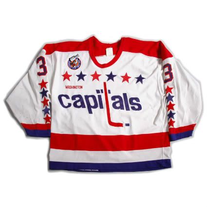
The original logo wasn't even really a logo as much as someone typed out the name and jammed a hockey stick in there. It looks like they had one of those office contests to decide the logo and only two people entered and they were forced to make it their jersey. And since the logo was bad, they just kept adding stars to the thing. Why not just get all 50 states on there?
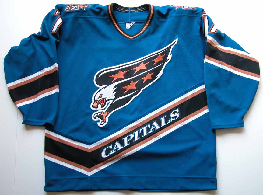
After that we moved onto the god awful blue/teal? and gold colors below. The eagle's wings are kinda weird looking, like there was an argument between people trying to preserve the "stars" from before and someone trying to make something that looked bad ass and they compromised and the former designer got the wings and other got the face and talons. The crooked stripes everywhere are terrible. The alternate black jerseys were pretty nice, if only because they minimized the impact of an awful color palette.
Then we arrive at today's jerseys - by far the best, but still far from great. The jersey itself is pretty awesome, it's modern without being too crazy. The colors are great and the striping on the sides and under the arms is pretty cool and unique. And they limited the number of stars!! But again, the logo is just kinda the name written out - they reversed the italicization and got a new font (which is better), but it's still based on a fairly lame logo concept. Then again, it's hard to have a bad ass logo when your name isn't something ferocious or terrifying like a panther, shark, or pen...errr avalanche, but refers to a city that is in charge of governance. Actually, that is a little terrifying.
")

Last edited by a moderator:
elocomotive
A useful idiot.
- 37,462
- 4,807
- 293
- Joined
- Apr 19, 2010
- Location
- Planet Mercury
- Hoopla Cash
- $ 201.67
- Fav. Team #1
- Fav. Team #2
- Fav. Team #3
Another most honorable mention
http://SportsHoopla.com/kpch4r3
Man, those jerseys suck CAC.
Similar threads
- Replies
- 38
- Views
- 1K
- Replies
- 0
- Views
- 154
- Discussion
- Replies
- 5
- Views
- 178
- Replies
- 16
- Views
- 399