
- Sports Forums Home
- College Football Forums
- College Basketball Forum
- NFL Forums
- NBA Forums
- NHL Forums
- MLB Forums
- Donate!
Navigation
Install the app
More options
-
Have something to say? Register Now! and be posting in minutes!
You are using an out of date browser. It may not display this or other websites correctly.
You should upgrade immediately.
You should upgrade immediately.
10 Worst Jerseys In NHL History According To TRL Hockey
- Thread starter IPostedWhat
- Start date


DevilishWon
Don't ever play Lady of Spain again
- 6,891
- 760
- 113
- Joined
- Apr 23, 2010
- Location
- Deep in the heart of Jersey
- Hoopla Cash
- $ 1,000.00
- Fav. Team #1

- Fav. Team #2

- Fav. Team #3

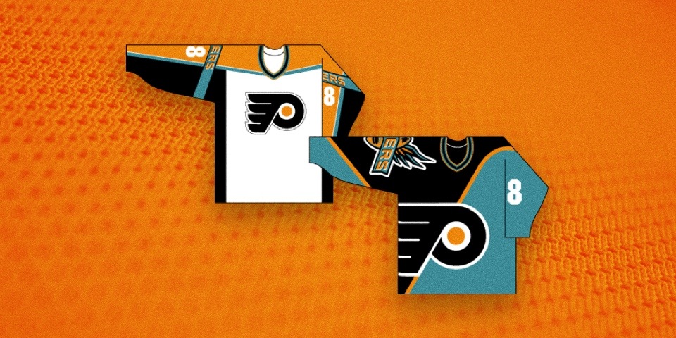
Was this one picked because of the actual Jersey or the name on the back?
http://trlhockey.com/wp-content/uploads/2014/07/sabres_third_jersey_1.0_standard_352.0-300x199.jpg
http://trlhockey.com/wp-content/uploads/2014/07/sabres_third_jersey_1.0_standard_352.0-300x199.jpg
dare2be
IST EIN PINGUINE
- 19,687
- 6,654
- 533
- Joined
- Apr 17, 2010
- Location
- Jax FL
- Hoopla Cash
- $ 1,000.00
- Fav. Team #1

- Fav. Team #2
- Fav. Team #3

Hey-o! We may not be terrifying or ferocious, but hey, we um, can persevere in the harshest of environments. Yeah, that's it.Then again, it's hard to have a bad ass logo when your name isn't something ferocious or terrifying like a panther, shark, or pen...errr avalanche, but refers to a city that is in charge of governance. Actually, that is a little terrifying.")
Your current jersey needs more stars.

oaknightshockey1
Well-Known Member
- 14,852
- 932
- 113
- Joined
- Aug 2, 2011
- Location
- Lincoln, Nebraska
- Hoopla Cash
- $ 3,928.18
- Fav. Team #1

- Fav. Team #2

- Fav. Team #3

Which ones are to like?
After that we moved onto the god awful blue/teal? and gold colors below. The eagle's wings are kinda weird looking, like there was an argument between people trying to preserve the "stars" from before and someone trying to make something that looked bad ass and they compromised and the former designer got the wings and other got the face and talons. The crooked stripes everywhere are terrible. The alternate black jerseys were pretty nice, if only because they minimized the impact of an awful color palette.
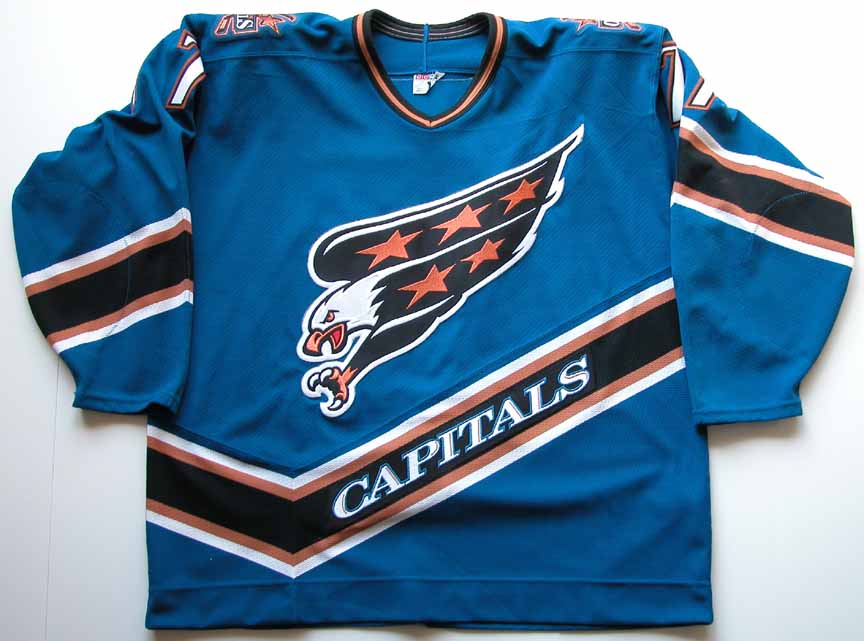
Then we arrive at today's jerseys - by far the best, but still far from great. The jersey itself is pretty awesome, it's modern without being too crazy. The colors are great and the striping on the sides and under the arms is pretty cool and unique. And they limited the number of stars!! But again, the logo is just kinda the name written out - they reversed the italicization and got a new font (which is better), but it's still based on a fairly lame logo concept. Then again, it's hard to have a bad ass logo when your name isn't something ferocious or terrifying like a panther, shark, or pen...errr avalanche, but refers to a city that is in charge of governance. Actually, that is a little terrifying.
I actually really liked the black/gold/teal color combo. It was something unique and I thought the white ones with the eagle were some of my favorites, not counting the obvious classics.
elocomotive
A useful idiot.
- 37,462
- 4,807
- 293
- Joined
- Apr 19, 2010
- Location
- Planet Mercury
- Hoopla Cash
- $ 201.67
- Fav. Team #1

- Fav. Team #2
- Fav. Team #3
I actually really liked the black/gold/teal color combo. It was something unique and I thought the white ones with the eagle were some of my favorites, not counting the obvious classics.
Fair enough. It's always going to come to personal taste to some degree.

Kevin12773
Boomer Sooner
- 5,998
- 1,724
- 173
- Joined
- Jul 5, 2013
- Location
- Central PA
- Hoopla Cash
- $ 1,000.00
- Fav. Team #1

- Fav. Team #2

- Fav. Team #3

I actually really liked the black/gold/teal color combo. It was something unique and I thought the white ones with the eagle were some of my favorites, not counting the obvious classics.
Me too!! Have a Bondra and Oates one in my closet. Brings back great memories of the cup run.
Center Ice
Well-Known Member
- 31,871
- 27,975
- 1,033
- Joined
- Jul 9, 2014
- Location
- Hockey World, Canada
- Hoopla Cash
- $ 1,004.55
- Fav. Team #1

- Fav. Team #2

- Fav. Team #3

Poor CI...
The transition has been a tough one for him.
I'm in therapy!!
<hangs head, dribbles beer>
Center Ice
Well-Known Member
- 31,871
- 27,975
- 1,033
- Joined
- Jul 9, 2014
- Location
- Hockey World, Canada
- Hoopla Cash
- $ 1,004.55
- Fav. Team #1
- Fav. Team #2
- Fav. Team #3
I'm in therapy!!
<hangs head, dribbles beer>
To all those who helped me through the dark times!!!
http://SportsHoopla.com/lfqy5jj
DragonfromTO
Well-Known Member
- 12,006
- 2,449
- 173
- Joined
- Jul 3, 2013
- Hoopla Cash
- $ 1,000.00
- Fav. Team #1

- Fav. Team #2

- Fav. Team #3
Which ones are to like?
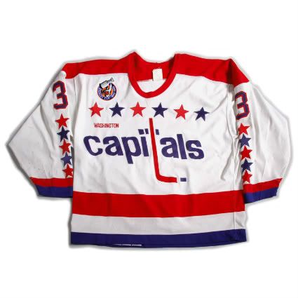
The original logo wasn't even really a logo as much as someone typed out the name and jammed a hockey stick in there. It looks like they had one of those office contests to decide the logo and only two people entered and they were forced to make it their jersey. And since the logo was bad, they just kept adding stars to the thing. Why not just get all 50 states on there?
After that we moved onto the god awful blue/teal? and gold colors below. The eagle's wings are kinda weird looking, like there was an argument between people trying to preserve the "stars" from before and someone trying to make something that looked bad ass and they compromised and the former designer got the wings and other got the face and talons. The crooked stripes everywhere are terrible. The alternate black jerseys were pretty nice, if only because they minimized the impact of an awful color palette.
Then we arrive at today's jerseys - by far the best, but still far from great. The jersey itself is pretty awesome, it's modern without being too crazy. The colors are great and the striping on the sides and under the arms is pretty cool and unique. And they limited the number of stars!! But again, the logo is just kinda the name written out - they reversed the italicization and got a new font (which is better), but it's still based on a fairly lame logo concept. Then again, it's hard to have a bad ass logo when your name isn't something ferocious or terrifying like a panther, shark, or pen...errr avalanche, but refers to a city that is in charge of governance. Actually, that is a little terrifying.

I actually thought the blue ones with the eagle were really sharp
forty_three
Stance: Goofy
- 50,377
- 24,918
- 1,033
- Joined
- Apr 19, 2010
- Hoopla Cash
- $ 1,000.00
- Fav. Team #1

- Fav. Team #2

- Fav. Team #3

I actually thought the blue ones with the eagle were really sharp
I agree, I still have a Kolzig one.
I did always wonder how it would look if the main color was red and the accents were blue, silver and white though. That whole "Let's market the Wizards and Caps together" was a bad idea. I think they missed an opportunity.
- Thread starter
- #52
IPostedWhat
I'm So High Right Now
- 45,362
- 25
- 0
- Joined
- Apr 27, 2010
- Location
- The Blue Lotus Opium Den
- Hoopla Cash
- $ 1,000.00
- Fav. Team #1

- Fav. Team #2

- Fav. Team #3

elocomotive
A useful idiot.
- 37,462
- 4,807
- 293
- Joined
- Apr 19, 2010
- Location
- Planet Mercury
- Hoopla Cash
- $ 201.67
- Fav. Team #1
- Fav. Team #2
- Fav. Team #3
Really cool article and some interesting tidbits. Thanks!
forty_three
Stance: Goofy
- 50,377
- 24,918
- 1,033
- Joined
- Apr 19, 2010
- Hoopla Cash
- $ 1,000.00
- Fav. Team #1
- Fav. Team #2
- Fav. Team #3
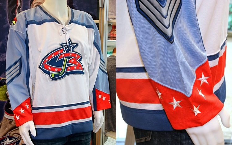
Jackets could have well made the list. This was the original concept:
pixburgher66
I like your beard.
- 26,285
- 521
- 113
- Joined
- Jan 17, 2010
- Location
- Pittsburgh
- Hoopla Cash
- $ 1,000.00
- Fav. Team #1
- Fav. Team #2

- Fav. Team #3

Jackets could have well made the list. This was the original concept:
Anything with the weird bug should have never happened. Cannon related concept is great for them.
- Thread starter
- #56
IPostedWhat
I'm So High Right Now
- 45,362
- 25
- 0
- Joined
- Apr 27, 2010
- Location
- The Blue Lotus Opium Den
- Hoopla Cash
- $ 1,000.00
- Fav. Team #1
- Fav. Team #2
- Fav. Team #3
Cannon related concept is great for them.
You can say that again....

forty_three
Stance: Goofy
- 50,377
- 24,918
- 1,033
- Joined
- Apr 19, 2010
- Hoopla Cash
- $ 1,000.00
- Fav. Team #1
- Fav. Team #2
- Fav. Team #3
You can say that again....
She said "Cannon" not "Creepy Civil War era dildo".
That first logo was pretty terrible. I like the newer one, but kind of wish they'd go with the current third jersey as the primary.
pixburgher66
I like your beard.
- 26,285
- 521
- 113
- Joined
- Jan 17, 2010
- Location
- Pittsburgh
- Hoopla Cash
- $ 1,000.00
- Fav. Team #1
- Fav. Team #2
- Fav. Team #3
She said "Cannon" not "Creepy Civil War era dildo".
That first logo was pretty terrible. I like the newer one, but kind of wish they'd go with the current third jersey as the primary.
The navy blue and cream one? Yes. BIG fan. I tend to think they'll move that way.
Similar threads
- Replies
- 38
- Views
- 1K
- Replies
- 0
- Views
- 154
- Discussion
- Replies
- 5
- Views
- 178
- Replies
- 16
- Views
- 399