- Thread starter
- #1
AlaskaGuy
Throbbing Member
- 76,595
- 22,698
- 1,033
- Joined
- Oct 5, 2016
- Location
- Big Lake, Alaska
- Hoopla Cash
- $ 14,312.00
- Fav. Team #1

- Fav. Team #2
- Fav. Team #3
Not as ghey as I was worried they'd be.
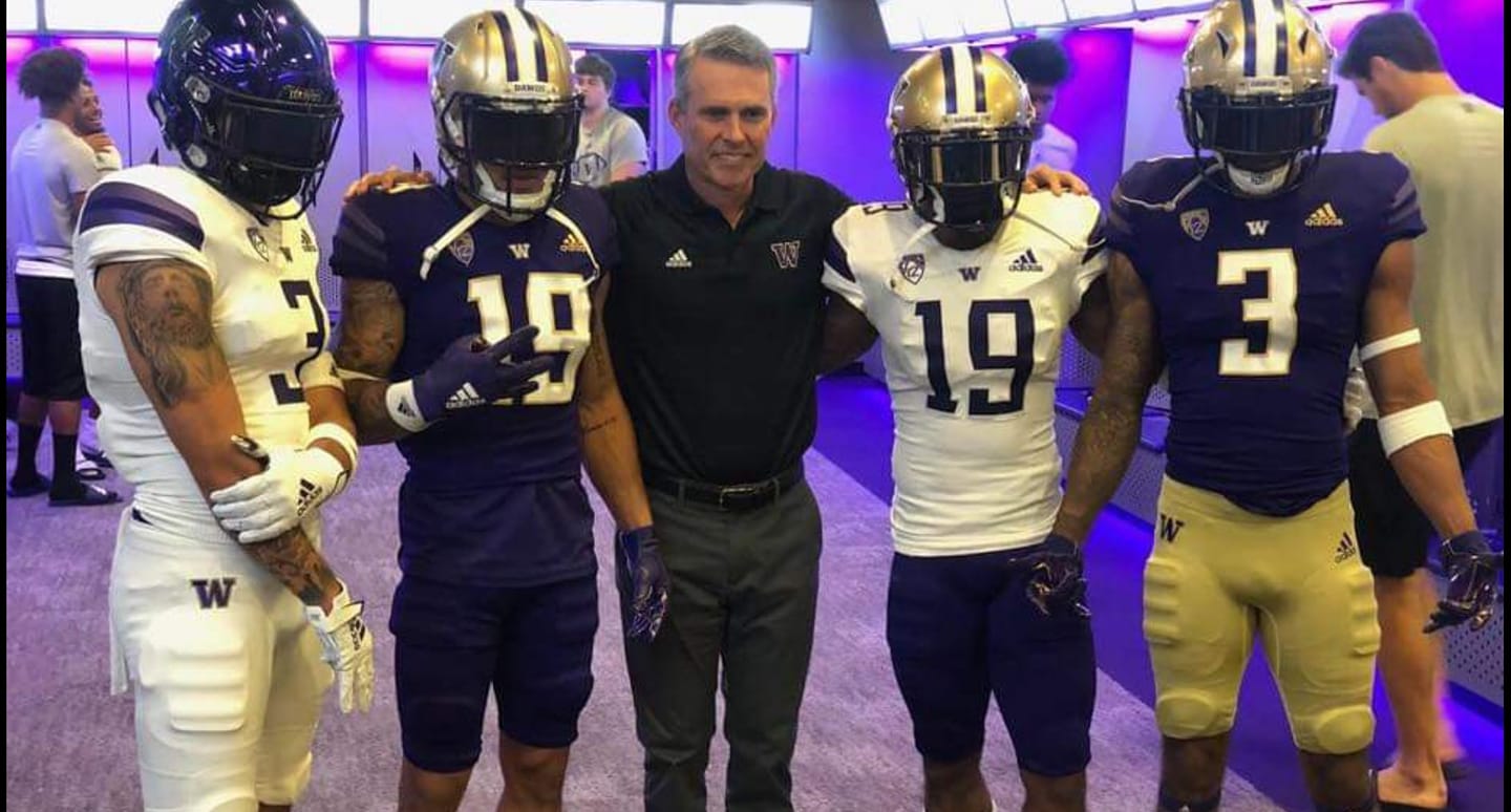


I'm not sure what the stripes on the sleeves are all about. Nike and Adidas both keeps fvcking with them trying to make them look trendy or some shit.I always like Washington's unis. Simple and tasteful. Not flashy and most importantly, no orange.

Adidas unis have a 'dull look' to them.This isn't an Oregon/Washington thing, or a Nike/Adidas thing.
Trying to come at this with pure unbias, those uniforms don't look bad at all, probably one of Adidas best out there, but there is something about Adidas uniforms that to me just don't look as nice or sharp? As Nikes or even UA's.
I cant really pin point exactly why, but they just don't have the "it" factor in the uniforms they make. I don't know if its just based off their past awful attempts to be flashy that have ruined their perception? Miami's uniforms aren't all that bad either.
maybe it's the stitching they do that just looks cheap? I don't know, thankfully they avoided their typical shiney thing they put on numbers or sleeves, like ASU, Kansas, etc. So these really aren't bad looking uniforms at all, but there is just something off with Adidas uniforms, no matter how traditional and normal they make them.


Yeah dull and they just look cheaply made.Adidas unis have a 'dull look' to them.


Still purple and purple is still extremely queer


that was my only problem too.I'm not sure what the stripes on the sleeves are all about. Nike and Adidas both keeps fvcking with them trying to make them look trendy or some shit.


Like these?Yeah. Most go way over the top and they look stupid as fuck. Those are pretty cool though.


Co-worker: “Hey bro, we’re fixing to go to lunch, you in?”Like these?
Agreed .. Nike snowflaked big time.snowflake gonna snowflake


For instance where Adidas went wrong with Miami's uniforms was the awkward placement of the U on their helmets. Hope Washington's "W" isn't as oddly placed at Miami's turned.
