- Thread starter
- #1
jayfan
{firestan}
- 2,300
- 563
- 113
- Joined
- Apr 17, 2013
- Hoopla Cash
- $ 1,000.00
- Fav. Team #1

- Fav. Team #2
- Fav. Team #3
If this is old news or has already been discussed, forgive me.
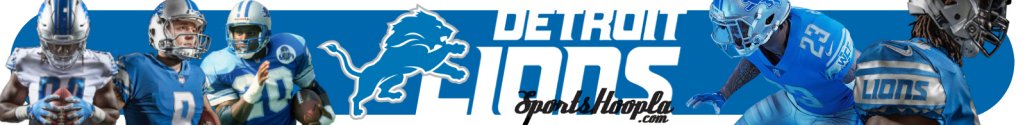
Looking at the Lions website for the first time in a while, the 'lion's mane' lettering seen in the banner above is gone. In its place is something worse. It's just generic and arena-league-looking. Plus, the 'n' in 'Lions' is a small n rather than a capital N, which is beyond annoying.
There does appear to be a bright side to the change however. It looks like black has been removed from the color scheme.
The Official Site of the Detroit Lions