• Have something to say? Register Now! and be posting in minutes!

Banner Voting

Which banner do you like better for the NHL board?

  • The team logo banner

    Votes: 28 54.9%
  • The player banner

    Votes: 23 45.1%

  • Total voters
    51
  • Poll closed .

elocomotive

A useful idiot.
37,462
4,807
293
Joined
Apr 19, 2010
Location
Planet Mercury
Hoopla Cash
$ 201.67
Fav. Team #1
Fav. Team #2
Fav. Team #3
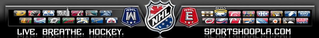
Okay, we've been kicking around banner talk for several months now. I think we have two well liked designs here and it's time to get a banner back up as the season starts. Both of the nominees below have tiny nods to Boss in them to preserve the homage to one of our favorite posters. SO... vote in the poll above for either:


(1) The team logo banner - IPW's sleek rendition of the NHL team logos that is clean and beautiful

9IdwBXb.jpg


(2) The player banner - my new banner featuring NHL legends on the left and current award winners on the right (with likely rotation throughout the year to change up the players)

307nce0.jpg
 
Last edited by a moderator:

Nasty_Magician

Team Player
18,986
4,466
293
Joined
Jul 6, 2010
Location
North Jersey
Hoopla Cash
$ 1,000.00
Fav. Team #1
Fav. Team #2
Fav. Team #3
I love the player idea however I'd prefer it were all classic players rather than new age players.
 

IPostedWhat

I'm So High Right Now
45,362
25
0
Joined
Apr 27, 2010
Location
The Blue Lotus Opium Den
Hoopla Cash
$ 1,000.00
Fav. Team #1
Fav. Team #2
Fav. Team #3
Well, I think it's fairly obvious which Banner is going to win, so I might as well just concede now, and we can just go ahead and put Elo's Banner up asap.

Congrats Elo.
 

elocomotive

A useful idiot.
37,462
4,807
293
Joined
Apr 19, 2010
Location
Planet Mercury
Hoopla Cash
$ 201.67
Fav. Team #1
Fav. Team #2
Fav. Team #3
Well, I think it's fairly obvious which Banner is going to win, so I might as well just concede now, and we can just go ahead and put Elo's Banner up asap.

Congrats Elo.

I wouldn't say that - it's early. I haven't even decided which one to vote for yet.
 

IPostedWhat

I'm So High Right Now
45,362
25
0
Joined
Apr 27, 2010
Location
The Blue Lotus Opium Den
Hoopla Cash
$ 1,000.00
Fav. Team #1
Fav. Team #2
Fav. Team #3
Would anyone be willing to give me any constructive criticism as to why they didn't like my banner?

You can do it in a PM if you prefer......I'm just curious is all.
 

Forty_Sixand2

Sleeper Pick
39,016
90
48
Joined
Apr 19, 2010
Location
The Nation's Capital (where the news comes from)
Hoopla Cash
$ 1,000.00
Fav. Team #1
Fav. Team #2
Fav. Team #3
I like the concept but the logos are kind of small and squashed. Would it be hard to make them a bit bigger and maybe bleed into each other some. The bottom third could probably be reduced in size as well to make room for bigger logos.
 

mattola

Scotchy Scotch Scotch!
39,577
11,822
1,033
Joined
May 9, 2010
Location
Planet Earth
Hoopla Cash
$ 1,000.00
Fav. Team #1
Fav. Team #2
Fav. Team #3
Would anyone be willing to give me any constructive criticism as to why they didn't like my banner?

You can do it in a PM if you prefer......I'm just curious is all.

I voted yours, it's a better design (no offense eloco) but elocos idea of the players is cool and I like the history of the game. But yours is crisp clean and has every team on it. You can't put every player on it or it would look like a doobster "art" work so I would rather have the teams. If somehow we could put fuck Dallas all the better but I understand why it can't be that way.
 

juliansteed

Well-Known Member
4,351
525
113
Joined
May 16, 2010
Location
Saint John, NB
Hoopla Cash
$ 1,000.00
Fav. Team #1
Fav. Team #2
Fav. Team #3
I love the player idea however I'd prefer it were all classic players rather than new age players.

I like the player banner too but I like the mix of classic and current players. Maybe change them up a bit once in a while too if it's not too much work (I have no idea if it would be too much work or not).
 

IPostedWhat

I'm So High Right Now
45,362
25
0
Joined
Apr 27, 2010
Location
The Blue Lotus Opium Den
Hoopla Cash
$ 1,000.00
Fav. Team #1
Fav. Team #2
Fav. Team #3
I like the concept but the logos are kind of small and squashed. Would it be hard to make them a bit bigger and maybe bleed into each other some. The bottom third could probably be reduced in size as well to make room for bigger logos.


Thank you for your feedback.
 

IPostedWhat

I'm So High Right Now
45,362
25
0
Joined
Apr 27, 2010
Location
The Blue Lotus Opium Den
Hoopla Cash
$ 1,000.00
Fav. Team #1
Fav. Team #2
Fav. Team #3
I voted yours, it's a better design (no offense eloco) but elocos idea of the players is cool and I like the history of the game. But yours is crisp clean and has every team on it. You can't put every player on it or it would look like a doobster "art" work so I would rather have the teams. If somehow we could put fuck Dallas all the better but I understand why it can't be that way.

Yeah, I always felt like players should go on a team's individual banner. This way you can showcase the history of that team with players over the years. When you have a banner for the NHL in general, it should include all the teams, because they all make up the NHL.

Then again, I'm getting my ass kicked, so my way of thinking could be flawed? :yahoo:
 

TheRobotDevil

Immortal
133,822
57,722
1,033
Joined
Jul 30, 2010
Location
Southern Calabama
Hoopla Cash
$ 666.00
Fav. Team #1
Fav. Team #2
Fav. Team #3
Since I don't have the absity to vote in polls can you add my vote to banner 1 I prefer the logos everyone represented
 

Comeds

Unreliable Narrator.
22,748
11,239
1,033
Joined
Apr 21, 2010
Location
Baltimore
Hoopla Cash
$ 754.60
Fav. Team #1
Fav. Team #2
Fav. Team #3
Would anyone be willing to give me any constructive criticism as to why they didn't like my banner?

You can do it in a PM if you prefer......I'm just curious is all.

I voted for the other but liked both.
 

elocomotive

A useful idiot.
37,462
4,807
293
Joined
Apr 19, 2010
Location
Planet Mercury
Hoopla Cash
$ 201.67
Fav. Team #1
Fav. Team #2
Fav. Team #3
I voted yours, it's a better design (no offense eloco) but elocos idea of the players is cool and I like the history of the game. But yours is crisp clean and has every team on it.

Crying-gifs-10112013-01.gif


I think Matty gets to the heart of it. I think the design/execution on IPW's is definitely better (I wouldn't have any criticisms of it). I think people just like the concept of the players better and as we saw in the NHL logos thread, there are some aesthetics that are just personal preferences. And thank you Matty for acknowledging that I totally ivented the idea of putting players on a banner. ;)

I think while the logos represent the whole league, the players show the action/excitement/passion of the game that we all love. It's possibly documented that I am not what one would call "the biggest fan" of the Penguins, but I love Crosby's exuberance in that photo and it's cool to see a guy like Mario in the banner. It makes me nostalgic for seeing him as a young lad. So I just think there are some emotional response to seeing these guys that the design itself has nothing to do with.

On the "representative" idea (and reading through the other thread), it made me think if we rotate the players once in awhile that will keep it fresh and ensure we have everyone represented at different times.
 

elocomotive

A useful idiot.
37,462
4,807
293
Joined
Apr 19, 2010
Location
Planet Mercury
Hoopla Cash
$ 201.67
Fav. Team #1
Fav. Team #2
Fav. Team #3
The player banner but it's missing the greatest goalie of all time

If the players' one wins, I'd say we could do something like the following on the Legends' side:
-Greatest goalies
-Greatest d-man
-Best scorers on the left side

And on the current players' side do something like:
-Best playmakers
-Most underrated players
-Best starting 6 roster

...etc. etc. etc.
 

Similar threads

Top