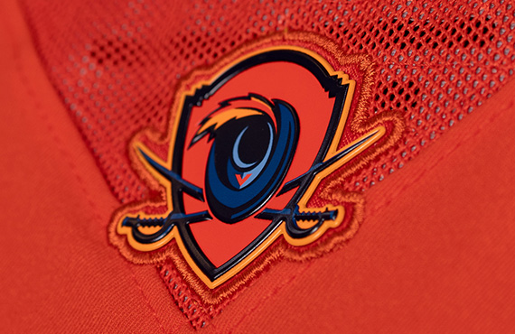
The one with the guy and the swords is terrible.. just like a turkey logo for VAtech.. no wonder kids leave the state to play college ball..
BTW VA goofed when it had the chance to hire Mack Brown. UVA can sell it's great academics and is in a talent rich state with a fertile ground in the DMV.
The one with the guy and the swords is terrible.. just like a turkey logo for VAtech.. no wonder kids leave the state to play college ball..
BTW VA goofed when it had the chance to hire Mack Brown. UVA can sell it's great academics and is in a talent rich state with a fertile ground in the DMV.
The one with the guy and the swords is terrible.. just like a turkey logo for VAtech.. no wonder kids leave the state to play college ball..
BTW VA goofed when it had the chance to hire Mack Brown. UVA can sell it's great academics and is in a talent rich state with a fertile ground in the DMV.
Wrong - the new "academics" VT design is worse. On Mack - only time will tell. He is on a recruiting uptick but that will only be sustained if he wins the games he is supposed to...


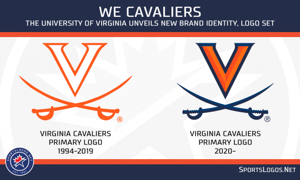
 These are not too bad